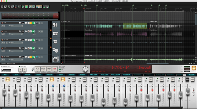
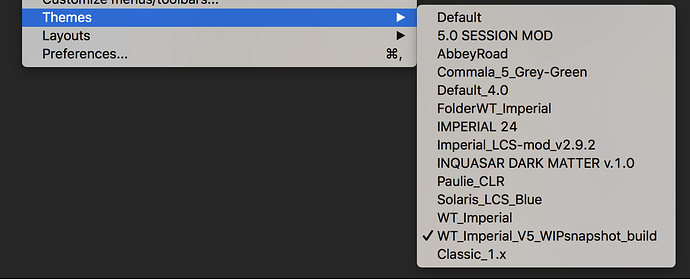
REAPER Themes, Configurability

IDK how many REAPER users are on this forum. I’ve been using REAPER ever since switching to Mac, years ago, cuz it was cross-platform, powerful and easy to use. It’s pretty amazing, actually.

Never cared for the cosmetics of it, really. However, REAPER allows you to change what it looks like and there’s quite a library of different themes. Thought I’d post a few of my favs, with d/l links. Enjoy!

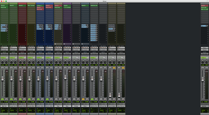
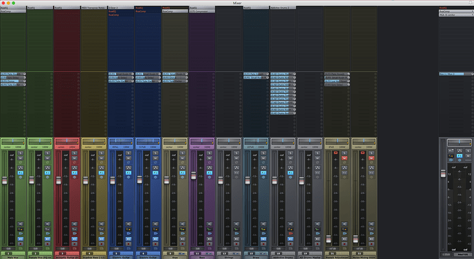
  1. Imperial – This one’s a beautiful interface, but I find it a little “busy” for me and fonts are hard to read. It’s popular, though. Download here.

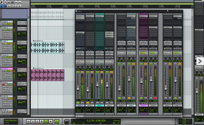
  1. Albert-C (Pro x-tools) – This one also, quite nice. Very clean. Pro Tools emulation. download here

Another pic:

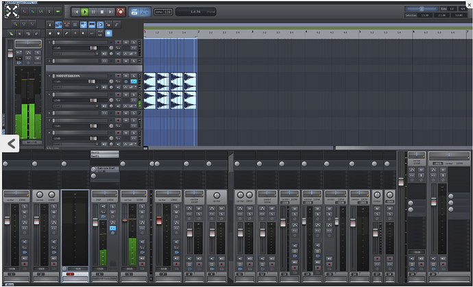
  1. This one’s my favorite: Rado 4 (download here)

Another screenshot:

3 Likes

Dude!! That’s awesome! Love the Pro Tools one!!!

By the way, the mouse drives me nuts. Do you know how to reset the scrolls to that the vertical and horizontal scroll on the arrange Window behaves like it would if you were using safari and chrome?

Oh man. I’m SOOOOOOO getting that Pro tools skin.

By the way…there are a LOT of Reaper guys in this group.

I really like the way rado looks, because it’s so easy to see. My biggest issue with every theme except for Paulie is that I really like the layout of Paulie. I like that the record arm and monitor buttons are on the left. I can’t find any other theme that is laid out that way and I’m too lazy to adjust it for myself, so I keep using Paulie and can never switch to anything else.

Think I’ll get the Pro Tools one… Then I can pretend I’m a pro.

4 Likes

I agree. It’s very nice. There are tons of 'em out there, but most of 'em, to my taste, are too cluttered, or dark, or weird colors. The Rado 4 and the Pro Tools are so easy on the eyes.

I’m not sure what you mean with the safari/chrome thing. So, in REAPER, the default is that if you scroll the mouse wheel over the track panels on the left in the arrange window, it’ll scroll up and down, but if you scroll over the clips part of the screen on the right it’ll zoom.

However, if you hold down the alt/option key (Mac), it doesn’t matter which part of the screen you’re on, it’ll scroll the waves/clips part of the screen right to left.

If you hold down the Cmd key, no matter where you click it’ll zoom the size of the track lanes in or out.

Also, if you put the cursor over the scroll bars, the wheel will scroll up and down.

That said, you can configure virtually anything in REAPER. This tutorial by Kenny Gioia (the guy has absolutely the best REAPER tutorials out there!) shows how you can customize mouse wheel and mouse behavior in REAPER. Go to 8:30 (actually, it should bring you there automatically).

Watch the whole video if you have a few minutes; it’s 15 or so minutes but you guys know you can speed up YouTube’s playback speed, right? On Mac, click > to speed up, or < to slow down (meaning, you need to hit the shift key). Or just hit the gear icon. Speed it up to 1.5 or 2x and it’s a pretty quick watch.

This video by REAPER Blog is also excellent and a little shorter.

Hope that helps!
I agree about the Rado. Not familiar with the Paulie. I’ll check it out.

If anyone’s interested, here it is. Very nice-looking. Track panels and buttons are so clean and crisp and clear. Very nice. Thanks, Boz.

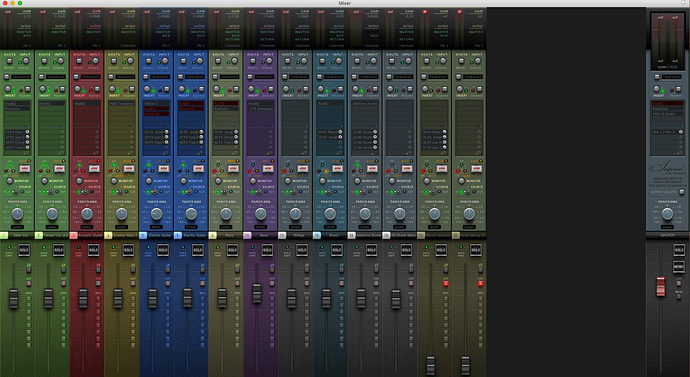
This is mine

1 Like

Which theme is that?

Its not a finished version.

You might have to search for it. This might help.

1 Like

WT Imperial is a very popular and nicely done theme. There are numerous mods on the Imperial. WT stands for “White TIe” which is the creator’s website. Check this out (their home page).

That’s actually related to the first one listed in the initial post. It really is very nice! Thanks for posting, vtr.

2 Likes

yup, this is the only version I have found where I can hide sections of the mixer to see more than one track on a 21.5" screen.

These things are designed BIG :slight_smile: I’d guess that was what Stan was alluding to.
2 Likes

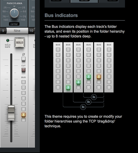
Only thing is I’ve never figured out how to use those buss lites on the channel tracks in the mixer. Has that made any sense to you?

not a clue :beerbanger:

…ok, it says here what they do, but i cant make them work either.

…anyone know what the TCP technique is?

1 Like

Well, TCP stands for “track control panel” – as contrasted with the mixing panel. So they’re saying that the lights will show a tracks position within a folder hierarchy if you set a track in a folder by drag-n-drop. So if I drop one track underneath another the light comes on, but only for the last track in the folder.

It’s kind of odd, actually. It doesn’t seem to behave consistently either. I haven’t found that to be very helpful. Apart from that, though, it’s a beautiful theme! I wish I could make those lights go away!

Its not working for me, at all. The Reaper folders idea is pretty clunky anyway. Just group it like its analogue, FFS. I never use them so they are are virtually useless, to me.

Yeah, I tried that Albert-C Pro Tools one again and the mixer is just huge, can barely see 1-2 tracks in the Track Edit window. I like the theme, but that’s kind of a PITA. If I use it I’ll probably hide the Mixer whenever possible. I tried it some years ago when first switching over from Pro Tools to Reaper, thinking that would make the transition easier, but eventually it got confusing as I was customizing Reaper so I went with the Reaper default theme to keep my head on straight. It’s become quite boring though, so I’m ready for a change. :slightly_smiling_face: I don’t remember the mixer being that huge though.

I found it fairly easy to switch/scroll themes with the Ctrl+Alt+Page Up/Down shortcut when I want to. :sunglasses:

Just a guess, but I opened TCP and tracks in folders are indented (if Indent Tracks in Folders box is checked). You can drag and drop tracks in TCP, so I’m guessing that’s what that theme wants you to do so it can keep up with changes. It must have been designed that way. I may try that too, if it’s easier than doing it on the Track Edit screen. I still have problems sometimes when moving tracks, and it won’t work the way I want. I finally just drag the tracks I’m trying to reconfigure in a folder to the end and start over, if necessary.

I found the version you can shrink (i think).

https://forum.cockos.com/showthread.php?t=183627

link is here

http://www.houseofwhitetie.com/reaper/WT_Imperial_V5_WIPsnapshot_build.ReaperThemeZip

1 Like

Yes, that seems to work much better, thanks! It also shows tracks in folders indented a bit in the Track Edit view.

I confirmed that when you create folders in TCP (highlight and Ctrl+F) that the last track in the folder makes that light come on. I don’t know how much good that does, but it’s interesting.

1 Like

ctrl+F still doesnt do anything for me yet, maybe TCP is infected :wink:

What does the TCP look like, maybe Im selecting the wrong bit?

Well, it’s the Track Manager window. I think that’s the same as TCP (Track Control Panel) but I may not be saying it right. Ctrl+F is a standard/default keyboard shortcut AFAIK, but you might check SWS and make sure it’s in there. It should work anywhere you have tracks selected/highlighted, so in the track window or Track Manager. Select/highlight the tracks you want to make a folder, hit Ctrl+F, and the first track should be the folder/parent and the last should be the last track in the folder. You won’t see a difference in Track Manager/TCP, but in the track window you’ll see the indented tracks, and the lights on the mixer window tracks.

One weird thing about this WIPsnapshot theme is that when pulling the mixer down it doesn’t resize, just the track bottom disappears from the main window. I guess it’s okay though, the bus lights may disappear but they’re not that significant really, and the bottom of the fader meter disappears which should be fine if levels are decent. Oh, but the default track numbers disappear too.

I’m not familiar with tweaking layouts and WALTER, but it looks like lots of things can be customized in this theme. The colored faders things is kind of neat. :slightly_smiling_face: I may have to learn about those things.

EDIT: Oh, and if tracks are collapsed (small) in the track window, a record-enabled track will automatically expand to standard size. And when disabled, it shrinks back to the small size of the rest. That’s kind of neat. :nerd_face: