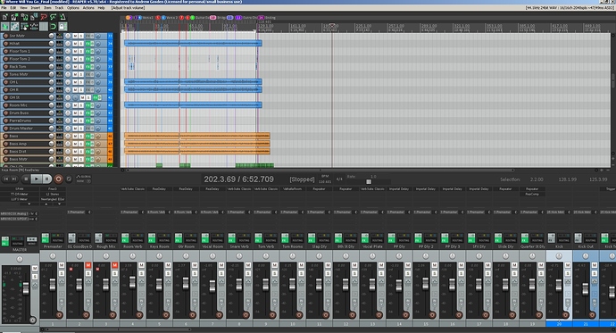
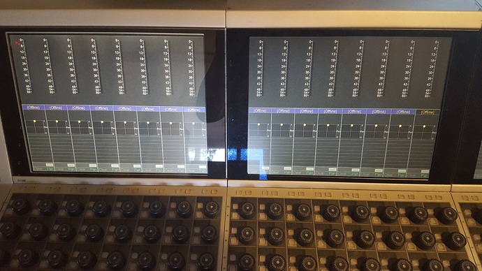
Good topic! Agree that it is useful to get into the habit of having some kind of system or organization. Which particular way you choose to go is far less important than just finding something that works for you and going with it. Mike Senior writes about the value of doing this in his excellent book on small studios (highly recommended!). One of the few times when I read a section and said “Hey cool, I do that already…”
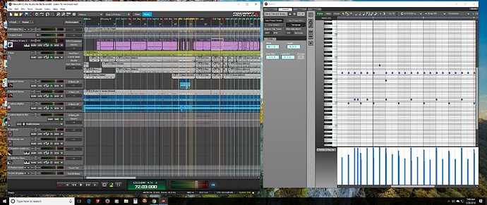
On screen real estate: I picked up a so-called ultrawide monitor for my music rig, which gives 2560x1080 resolution at about 32 inch overall screen width. I’d used a pair of venerable 15" monitors before that, from previous computer builds, and got this when one of those finally gave up the ghost (got a LOT of years outta that sucker). This way I can have lots of things on screen at once without any break or scrolling required.
Since I have much more horizontal space than vertical, I tend to undock the console from the track workspace and have it to one side; in my DAW (Mixcraft) the console window also includes tabs for project data (text fields for annotation), sound properties (including MIDI editing), and the built-in sound library (which I pretty much never use anymore). In this view I have a MIDI sound selected and the Sound tab chosen:
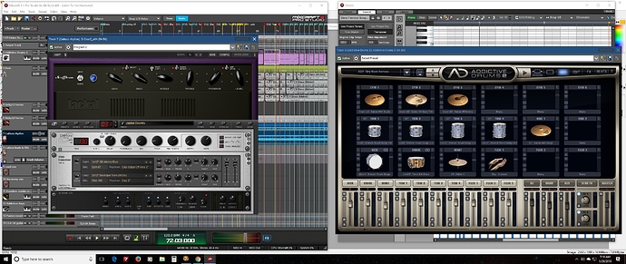
Then when I want to open whatever VSTi or plugin, I just leave them overtop while fiddling with them and bring forward the workspace as needed, just placing them where I can click on pieces of their windows to make them the focus:
These screens are from a recently-begun project (cover of a Tom Petty tune), so it’s nowhere near the final state btw. Lots more to go but makes a useful example for this question…
I also set the track colors so that I can see at a glance what goes with what. Guitars are in blue, bass in green, drums in purple, and vox will be in red once they’re tracked. I also make heavy use of track markers, also color-coded, separating verses, choruses, bridge (and usually sections within each of those), with blue flags for verses, red for choruses, yellow for bridge, aqua/turquoise for intros and outros. The colored flags are useful during tracking, because I can just glance at the screen and be reminded that the chorus is about to start or whatever.
In terms of track order, my usual is to have at least one reference track at the top, with a separate output channel for them right beneath, so that I can a/b between them and my mix. But lately I’ve been using the plugin REFERENCE by an outfit called Mastering the Mix for that, which greatly simplifies the process of one-click switching between many ref tracks and the mix.
Then my sequence is the rhythm section tracks (bass, drums; sometimes the drums are a submix with the kit pieces within, but not in this example), guitars (plus mandolin if I’m using that), then keyboards and finally the vox tracks. In the views I posted, greyed-out tracks are muted, and you can see in the bass track all the bits and pieces from the multiple takes I did, from which I comped the final track (haven’t discarded those remnants yet in case I need them to replace an errant note that I have not yet noticed, but will once I can commit to the final).
At the bottom are the sends. Right now I have just two, a compressor for guitars and a reverb. Will no doubt have a couple more before all is said and done on this project. I have many of these tracks shrunk to min height to take up the least vertical space possible, but will expand them as needed as I proceed.
Again, the particular order of all this is really of no consequence provided you start with more or less the same setup each time and then modify from there as the project dictates. I do find that the color coding is really important for me for whatever reason…
Hope this helps!
