Hey guys, I’m gonna park some dialogue here with my web developers (who are already previous members on this site). Mainly because if I send email attachments of images, it doesn’t preserve the format of specific pictures in relation to specific content.
Hey Paul…Lisa…I liked the previous 4 designs, but I was hoping for a logo that clearly and concisely related to the audio field. I took some screenshots of ones that I liked, but I don’t want to use because any else can use them also…they’re up for grabs for anyone, and its important to me that mine is distinct.
I’m leaning away from the ones with music notes, because they’re relevant only to music recording.
This one would be cool if I was a music recording facility, but I think it limits brand away from the other more important stuff
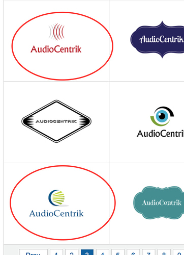
The radio towers don’t work either…
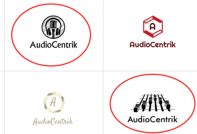
Here’s a few that I liked conceptually, but I can’t think of how to create an identifiable audio related object into the theme
These are conceptually clear, but way too busy.
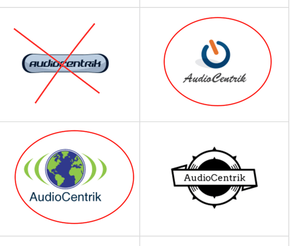
I like both of these in the corners…if you could replace that earth with something music related (or maybe just throw an A in there) or if that power button could somehow be tailored specifically to this company.
This one is REALLY close too… something I would love to use. Meets all the criteria of modern look, very simple, and easy to understand.
Same with this one. The problem is the squiggly line has nothing to do with anything sound engineering related.
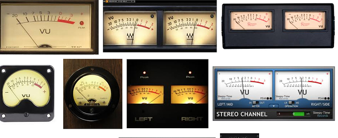
Here’s 2 ideas I had, but they might not be good ideas. In audio we have what’s called a VU meter…they’re pretty recognizable to anyone who works in the field. If there was a way to make this look like an A or less like a heat thermometer, I’d be open to it!
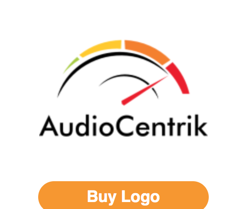
This what a VU meters look like…
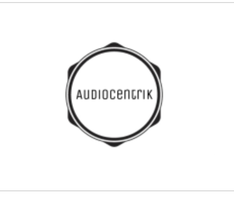
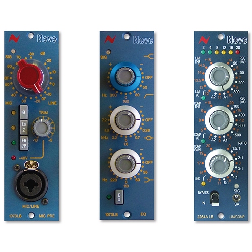
Also, if you put an A or the name inside of something that resembled a knob on a mixer, maybe by making dashes around the outside that look like markers, it might be interesting…
 I directed Lisa here in a reply to the e-mail she sent me this morning. Thanks!
