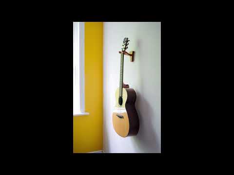
Here is a little ad we ran it has already been posted but any feedback will definitely be helpful on future ads. Thanks.
Looks great! Quick eye catching and gets the message across with a nice twist with the wine.
Well done. 
Thanks Emma. That is what we were going for so it is good to hear.
Is there a technical reason you went with vertical video?
I think the lighting could use a lot of work. Most of the products look like silhouettes compared to the bright white wall because all the light is coming from behind the objects. You need some light to fill in the front to make it look more light studio lighting instead of bedroom lighting.
Also, I’d go for a smoother zoom in at the end. With the abrupt start and stop of the zoom it feels a little funky. Maybe a slow zoom throughout the entire video?
I like the vertical ad personally. It stands out as most do the standard 16x9. An occasional vertical ad is memorable.
I agree with the lighting in previous comment. Frames have a distracting glare. However the overall ad works I think
It’s probably just me but I don’t like fast hard cuts. I know you see them everywhere but I think smoother transitions are more attractive and you still have enough time to make your point about versatility.
Thanks boz that is good feedback.
We did it because we were running it as an instagram ad.
Yeah we are applying for a grant to get some equipment top in the list is lighting.
Yeah i should have used a curve on that zoom for both ends. I have not done that in premiere for a while but i am sure it is not hard. Just didn’t think of it, excellent.
Thanks Michelle for the feedback.
Very interesting since I would have no idea to realize an add for that kind of product.
I won’t copy previous comments but I found the scenery too empty (two walls and a fake window as a light spot): I think whatever you could add on that topic would create something more “realistic” like Ikea adds showing their stuff in somehow real environment.
Soundwise, I found the soundtrack heavy on low end part and I’m not sure that’s the way adds are 
By the way, still very interesting to see way different stuff here, congrats for that project!
Thanks for the feedback.
Actually we had to shot this in the upstairs of our shop because we have not been able to get some decent lighting equipment. So that funnily enough is one hundred percent real two walls and a window to provide light.
That is a good idea I should look at some ikea ads for some inspiration on future ads.
I don’t know really what other ads are like so it is just heavy because I tend towards a heavy low end when I mix. I am trying to work on that so thanks for the heads up.
Ok then, thru the video, it looks to me like a studio with temporary walls built for the purpose, too perfect to be real (or sort of).
Because ads are heavily compressed and vocal should be very upfront to catch the audience, it needs to be light on parts driving comp/limiter (like low end stuff)
I found this one which is about Ikea, show the product in “real” environment, is 30s long and has some music, speech and you could hear music disappears when speaker begins (like there is too much compression).
